Thursday, September 18, 2008

The Worlds Quickest Introduction to
Copywriting for Direct Mail – Part 1:
It’s measurable


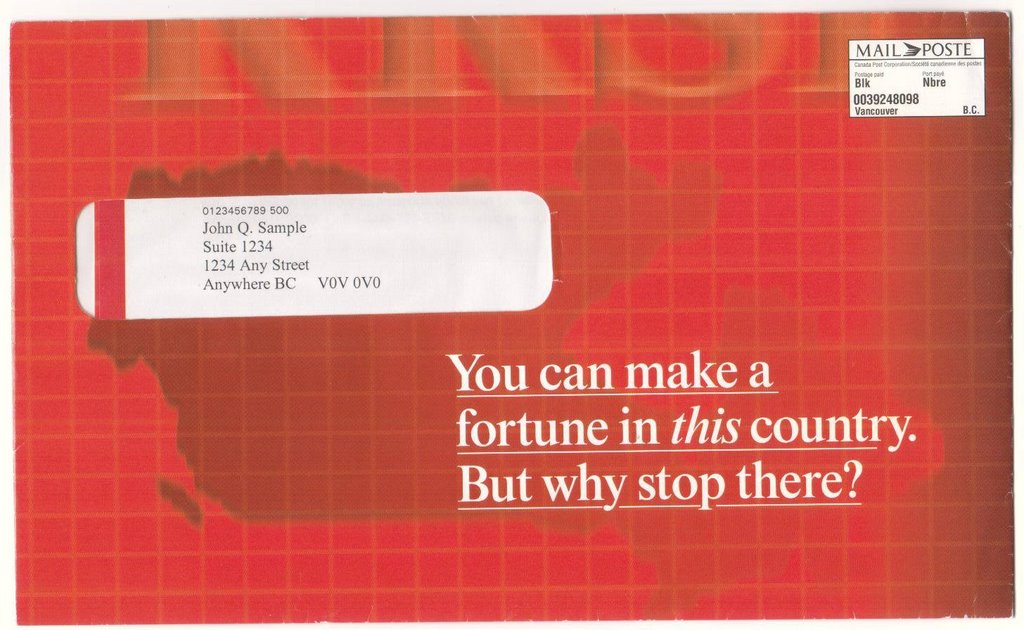
Direct mail is a subset of Direct Response Marketing. All forms of direct response, including direct mail give you results you can measure accurately. Image and awareness advertising – which you see so much of on TV – cannot do that.

Because direct mail is so measurable, it puts an onus on the copywriter to get it right. Fortunately, expert direct mail writers have tools and techniques that get results. Over the next few posts, I’m going to reveal some of those tools and techniques.

First, there are five key components to any direct response campaign, in any medium:

1. List – also known as target audience. This may be as broad as everyone who reads the Wall Street Journal, or watches Anderson 360, or as narrow as left-handed CEOs of biotech companies. How broad or narrow depends on what you are trying to sell, and the budget you have to acquire contact names.

2. Offer – Why should somebody buy this product or service from you. What’s in it for them? Special pricing? Two-for-one? Bonus add-ons? Longevity? More time off? Greater ability to concentrate? Tips for successful online marketing? What’s important is not your product or service, but its immediate and secondary benefits. The job of the Direct mail copywriter is to SELL THE OFFER, not the product.

3. Copy – we’ll get to that soon, but you need this background, first.

4. Graphics – This is what the designer does to make sure you get noticed, and that the reader’s eyes are directed through the piece to the point where you ask him or her to take action. Graphics should promote readability and reflect your brand or image.

5. Timing – Direct marketing guru Herschell Gordon Lewis says “Shoot while the ducks are flying.” Don’t try to sell snow tires in July or Bermuda shorts in January (unless they are part a cruise package to Bermuda). Much of timing is out of your control. You probably can’t sell to somebody who’s just been fired, and equally, not to someone who’s celebrating a promotion. You overcome bad personal timing through repeat mailings.

The 40-40-20 Rule says: 40% of your success comes from the list you use, 40% from the offer you make, and 20% from all the rest.

That’s enough background….


Part 2: Big Guns

The first rule for writing for direct mail was codified by Herschell Gordon Lewis who said: “Fire your big guns first.”

What does that mean? It means get to the point as fast as you can. You have somewhere between one second and 10 seconds to hook your audience, so don’t waste time warming up and don’t waste time talking about yourself. Talk about what your audience wants.

“At 21st Century Dietetics, we have over 25 years helping people like you lose weight.”

What’s wrong with that? Plenty. Nobody cares about the experience of 20th Century Dietetics – at least not at this point in the sales pitch. Also, what could be less specific than the proposition to “lose weight.”? The response from virtually any reader is going to be: “So what! Who cares?”

“Need to lose 20 lbs. before Christmas?”

Now, that’s better. It’s got specificity and a deadline. It’s got an implied you. You’re talking directly to the reader about something they want. It’s also got the nice, relaxed pattern of normal speech. And it’s economical – seven words instead of 15.

Here’s a secret: The goal of expert copywriters is to have their copy become invisible. You don’t want the reader overly aware that they are reading copy. You don’t want them stumbling over difficult words and awkward phrasings.

Which leads us to another important copywriting tip: write to the background, experience and expectations of your readers.

· If they are ordinary people, use ordinary words.
· It they are technical or scientific, throw in an aliquot of technical terms.
· If they are highly educated, a dash of elevated diction and syntax may be in order.
· But remember this, you can almost never go wrong being simple and direct, no matter who the reader is.

“Promise, large promise, is the soul of an advertisement,” said the 18th Century writer Samuel Johnson. When he was asked to auction off a brewery he remarked: “We are not here to sell boilers and vats, but the potentiality of growing rich beyond the dreams of avarice.”


Part 3: Five Motivators

Near the beginning I shouted: SELL THE OFFER.

What does that mean?

The offer is the theme of your communication. Begin with it. Restate it. Denote its key benefits. The actual product or service is largely incidental to your sales pitch.

Let’s go back to the weight loss example. Remember, the big gun you fired first was: “Want to lose 20 lbs before Christmas?”

At this point you could be selling diet pills, exercise equipment, a course in Pilates, motivational training or personal coaching. It’s appropriate now to tie your product to your offer:

Want to lose 20 lbs before Christmas?

On average, people who use the 21st Century Dietetics Method easily lose one pound of excess fat a week. Ask your dietician or doctor and they’ll tell you one pound a week is a safe, healthy amount of weight to lose.

Did you notice something? That’s right, the first paragraph consists of a single short sentence. The rule in firing your big gun is to keep your first sentence to 12 to 15 words, or less.

Another rule is: No long paragraphs. Keep your paragraphs down to 5 - 7 lines – which may equal only two or three sentences. And insert a space between paragraphs to break up your copy, making it look easy to read.

Herschell Gordon Lewis (him again!) says there are five main motivators to consider in your copy:

· Fear
· Greed
· Guilt
· Exclusivity
· Approval

Fear is the strongest, but also the trickiest, motivator, because it knocks people on their asses.

If you are 30 lbs or more overweight you are a prime candidate for colon cancer.

Scary stuff. Enough to put them off reading any further – until you quickly offer them a hand up:

But now there’s a weight loss supplement that contains a powerful, natural, cancer-fighting ingredient…

To find out more about motivators, buy a copy of Lewis’s On The Art of Writing Copy.

One last comment on writing direct mail copy. It’s not clever, witty, cute or funny. It’s selling, and it’s serious. As Lewis says: “In the age of skepticism, cleverness for its own sake may be a liability, rather than an asset.”

Or to put it another way: When’s the last time you bought anything from a clown.

Tuesday, August 15, 2006

Samples of My Freelance Work


1. This banner ad got a whopping 7% CTR on sites in Germany (in translation). Why? It tells a story out-of-work Germans can identify with in what was formerly a country noted for stable employment.


2. This was an email/website, multi-part trivia quiz that got great results for Voice Mobility, a company in the telephony space. It also won a Gold Lotus for best email campaign.


3. These kangaroo panels, in a rotating animation, went over big in Australia. Note the use of Aussie slang: "bludger" (a mooch) and "vegging" (no explanation needed). Did the same with a whole series of ads featuring moose (alas, no samples) that did really well in Germany and Scandinavia -- where, apparently, moose fascinate them. A weight-loss ad had two moose. One says: "Why don't I see any fat moose?" "Wolves," the other replies.


4. This is the envelope from a campaign for HSBC. Got great results, and a Gold RSVP award.


5. This was a two-part teaser program for Voice Mobility (VMI). Its job was to stick a great big foot in the door with top telephony execs who weren't taking calls from VMI sales. It worked!


6. The following two banner ads got great response rates in Australia and Europe (3% – 4% CTR). The “Fat Guy” was especially successful in Sweden: “Looking for a weight-control plan that really works?” The “Arse” ad appealed to Aussies, who have a cruder sense of humour than you could use in North America.


7. This is another ad that goes against type (see the conventional ads shown below it). It worked very well in England, where they like this sort of humour -- note the "Englishy" diction. You have to speak your audience's language.


8. More conventional stuff -- works OK in North America, but I never did discover what would really crank up the CTRs the way I was able to in Oz, Europe and the UK. Are North Americans too bland?


9. The Swedes loved this one. Went well in the rest of Europe, and in Brazil. Was considered too "saucy" for North America. Ho hum.


10. This is the lift-letter from a fund raising package for Central City Mission. Note that it tells a story -- one of the most compelling ways of reaching an audience. There were two teaser lines as the letter unfolded. "What's this nice, clean hotel doing right across the street from the city's most notorious drug corner?" ... "Providing safe, friendly living for people with nowhere else to stay." Click on the picture for a bigger image, then click again for a readable image.

Monday, May 15, 2006

10 copy tips to help you sell more

Copy that sells is closely related to talking. Not sloppy, everyday jabbering, but the kind you’d hear from a friend who is excited to tell you something. Here are some of the ways you can make your writing more compelling (and they also apply if you’re writing for a website instead of print media). Some of these are my ideas, some I learned from others. I’ve put my spin on all of them.


1. Start with a bang: People are short of time and have no patience for pre-ambles. So lead off your writing with your main offer, benefit or promise:

Don’t say: “It’s a new season, which means it’s time to change your tires. And, this week only, you can save $300 on a set of new summer radials.”

Say: "Hey Bob, this week only you can save $300 on a set of new summer radial tires."

Don’t say: “Looking your best means having your teeth their whitest. Now you can whiten your own teeth, at home….”
Say: “Guess what Dani, I got my teeth 5 shades whiter at home, in two weeks, for just $20.”

Don’t say: “Arthritis sufferers endure constant pain that just never seems to go away.”
Say: “Do you wonder if you’ll ever be free of arthritis pain?”

2. Keep sentences and paragraphs short: Most of your sentences should be no longer than 12 - 15 words. They should rarely exceed 20 - 25 words.

3. Use more white space: Make sure your paragraphs seldom exceed 5 lines and never more than 7 lines. Put an extra line between each paragraph. White space makes your text look less difficult and more inviting to read.

4. Make your text scannable: People don't like to read; they prefer to scan. You can help them do that by keeping your line width down to 65 or 70 characters. You can also make your text more scannable if you:

5. Use subheads every 3 or 4 paragraphs: Subheads let your readers know if they are going to find anything of interest in the text that follows. You can also use subheads to tell a mini version of your story:

We woke up to the sound of Sarah gasping for breath...

By the time we got to her she was unconscious...

The ambulance crew revived her -- this time...

But what about next time?

In a fund-raising letter, those subheads could separate extra details about what asthma sufferers go through and what's being done, with donations from the reader, to find a cure.

6. Use familiar words: Despite our high literacy rate, many people have difficulty reading. They may recognize a big word when it's spoken, but rarely bother to puzzle out its sound when they read it. For example, paraphernalia and accoutrements are harder words to read and understand than gear and baggage.

So leave those "intellectual" words behind. Choose speed up over accelerate; good looking over attractive; worried over concerned; use over utilize (when I teach, I offer my students $1,000 if they can compose a non-self-referential sentence (such as I define utilize as...) using utilize in such a way that I can't simply substitute use and have the sentence retain all its meaning.).

Exception: You can use more "intellectual" words when you are aiming at a more educated audience and want to subtly stroke their egos by using a loftier tone.

7. Use one or more of the 5 great motivators (Thank you, Herschell Gordon Lewis): All sales messages fall into one or more of these five categories: fear, greed, guilt, exclusivity, approval. Those are the basic emotions that drive people to want and buy things -- especially things they don't really need. Of these, fear is the most powerful, but take care how you use it: Don't scare people wihout also showing them how what you offer overcomes their dread.

8. Don't let people say "SO WHAT?!" Did you know 9 out of 10 teenagers have acne? So what! Who cares? Why are you telling me this? Any time you make a statement or claim, make sure people can't respond with indifference. Will your teen be scarred for life by acne? is much more powerful.

9. If you make a claim, can you prove it? You've tried the rest, now try the best is not only a cliche, it's a hollow, unprovable claim. In a taste test, three of New York's top chefs said our tomato sauce tasted most authentically Italian is a claim that is backed up. Don't believe it? Here are testimonials from the chefs!

10. Find your real beginning: Athletes warm up. So do musicians. And so do writers. When you've finished your piece, set it aside for an hour or so, then read it through. You may find your real starting point is 3, 4, or 5 paragraphs down -- after the throwaway lines you wrote as you warmed up to your topic. I've seen letters where the real beginning was 14 paragraphs down!

BONUS TIP: Know who your customers are and talk to them about things they want to know -- which aren't always the things you think you ought to tell them. Talk about them, not about you.

John Friesen has 25+ years writing successful direct response for all media, traditional and online. Want better marketing results? Call him at:

604-812-1332

Five key tips to build
a website that works


Books have been written about website design, and you can learn much from most of them. But if you want to make sure you get the best results from your website – whether for sales or branding or giving out information
then you should pay particular attention to these five things:

  1. Don’t be clever: Depending on whose estimate you believe, most visitors to your website will spend from 5 seconds to 20 seconds – no more – deciding whether your website is giving them what they want. Flash intros and animated elements do more to annoy people than to entice them. If you feel a fancy or clever introduction is part of your branding, then do it, but make it fast, make it relevant, and always give a “SKIP INTRO” option.

  2. Get right down to business: What is your website (or your business) about? No, it’s not about making widgets or providing a professional service. It’s about providing a clear benefit to your customers. So find a way to describe your business as a benefit. Then make sure that benefit is one of the first things a visitor sees when they land on your home page. Put the benefit in a headline and, if you can, illustrate the benefit.

  3. Offer something on your home page: People love to get things free. So find something free you can give them – a screen saver, a white paper, a useful program or program enhancement. Try to make the offer relevant to your business and its benefits. You can also use your offer as an opportunity to gather your visitors’ names and email addresses.

    Don’t discount viral possibilities. If you offer something that is really cool, people will pass it on to friends and colleagues. Then they’ll tell two friends… and so on… and so on. Two huge examples of viral marketing successes are Elf bowling by Nstorm, and Whack-a-Flack by e-tractions. Both games were sent out to a few seed email addresses, and before long, millions were playing. You can find both Elf Bowling
    and Whack-a-Flack by typing those names into your favourite search engine. (WARNING: really cool offers may distract your visitors).

  4. Keep your navigation simple: How many times have you visited a website only to find you don’t know how to get to the part you want? And how many websites have you seen with navigation links on the top, side and bottom of the page? All you need is one clear set of navigation buttons. Current thinking has the left hand side as the best place for those buttons, but you won't lose people if your nav-bar is at the top.

  5. Pay attention to eye movement: Your eyes do not scan in a left-to-right linear progression down the page. There are starting points and hotspots (see illustrations) which you should keep in mind when designing your pages. Put the important information where it will be seen by even the most casual scan of your page.

Here are some of the results of a
study by the Poynter Institute
of St. Petersburg, FL as reported
in Eyetrack III:

“The eyes most often fixated first in the upper left of the page, then hovered in that area before going left to right [Fig. 1].

Dominant headlines most often draw the eye first upon entering the page -- especially when they are in the upper left, and most often (but not always) when in the upper right.

Photographs, contrary to what you might expect … aren't typically the entry point to a homepage. Text rules on the PC screen -- both in order viewed and in overall time spent looking at it.


We observed that with news homepages, readers' instincts are to first look at the flag/logo and top headlines in the upper left. The graphic [Fig. 2] shows the zones of importance we formulated from
the Eyetrack data.

While each site is different, you might look at your own website and see what content you have in which zones.


John Friesen has spent 25+ years creating successful direct response marketing in all media, traditional and online. He can definitely show you how to get better results from your marketing dollars. Call him at 604-812-1332.

Tuesday, May 09, 2006

How to work with John Friesen,
and 9 good reasons why you ought to

Let's start with why...

1. I’m knowledgeable in all areas of direct response marketing, with years of experience and countless examples of highly successful work. Let me know when you want to see some of them.

2. I start my work by trying to understand your customers.

3. You can get a full range of the services you want from me: strategy, research, concepts, design and copy, production and project management, and campaign analysis.

4. Although I have received several awards for my work -- Gold and Silver RSVP awards and the Golden Lotus award -- I believe, in the words of direct response genius Lester Wunderman, that "The only thing that matters is results!"

5. Whatever
industry you may be in, chances are I've worked in it, from high tech to financial services, from travel and leisure to automotive and retail sales.

6. Pick your media -- or better still, an integrated mix of media that will get you maximum returns. I've worked in
all media, online and offline, from print and TV, to direct mail, email and web-based advertising and marketing.

7. You can rely on me for
effective communications materials: direct mail letters, brochures, ads, feature articles, speeches and presentation materials, film, TV and video scripts, press releases and IR support, newsletters, emails, banner ads, case studies, white papers, annual reports, manuals and product guides, and more.

8. Need results fast? I can turn your project or campaign around in far less time than you might think – for a rush fee, of course.


9. I’m
resourceful and inventive, and completely focussed on getting better results for you.


Now, here's how to work with me...


1. FREE CONSULTATION: Decide what you need, or consult with me for a recommendation. Initial consultations are always free.


2. FLEXIBLE RATES: Depending on what your project needs are, I can work with you on retainer, for a fixed fee, or on an hourly rate. I’m also open to projects that reward me for results.


3. FIND ME EASILY: You can reach me by calling 604-812-1332, or by sending an email to
jffriesen@shaw.ca

4. FAST WORK: Direct mail campaigns normally take 6 to 8 weeks to complete, at a minimum. However, I have turned projects around in as little as 10 to 15 days. It depends on the work you need and the amount of research necessary. Simpler projects, such as brochures or sales letters take less time, though I prefer to have 2 - 3 weeks to fit you into my schedule and give you my best work. But whatever the timing is, you can rest assured I meet all agreed-to deadlines.


5. REVISIONS: Revisions are included in my fees; they include correcting omissions and factual errors, spelling, grammar, style and organization of the work. However, if your revisions are based on new information or a change of direction, I reserve the right to renegotiate my fees.


6. ADVANCES: Normally, I ask for a 50% deposit before beginning work. If you have a major project spanning more than 30 days, then we can arrange for progress payments, beginning with 1/3 in advance. Final payments are due within 7 days of delivering the completed, approved work.


7. KILL FEES: If you decide to cancel a project after I’ve begun, a kill fee in the amount of your deposit applies. The same kill fee applies if you cancel after the first draft. However, if you request one or more revisions before cancelling, my entire fee applies.


Try me the next time you need a direct mail package, a sales letter, or any other writing for marketing or corporate communications.

I'm sure you'll be delighted with the results.

Friday, May 05, 2006

obats

Getting noticed, or...

How I learned to stop counting and love factoids

AH! JUNK MAIL. Despoiler of forests. Clutterer of mailboxes. We love to hate it. But, as one sage in this business remarked: "It's only junk mail if it doesn't offer you something you want."

That, really, is the essence of effective direct mail: "Give them something they want."

Notice how similar that is to the retail maxim, "The customer is always right." No matter how elegant, different, charming, or chock full of rewards and benefits your mailing is, it's junk mail if the person receiving it says so. Don't bother arguing with them. Remove them from your mailing list. Most people will say nothing, however. They just won't notice and therefore won't read your message before consigning it to the recycling bin. So, how do you get them to notice you?

Getting noticed involves a lot of psycho-technical research (mumbojumbo) mixed with a little trial and error (guessing). This business is full of what some call factoids -- things that sound as though they could or should be true, so we accept them as fact. Like: 74.63% of people will believe any statistic expressed to two decimal places.

Factoid: Call me anything, just call me often

Example: Send the identical mailing to the identical list one week later and you'll boost your overall responses by up to 50%.

There's good reasoning behind that: Not everyone who would respond to your mailing will respond the first time because of temporary distractions or preoccupations -- they've caught cold, had a fight with a child or spouse, celebrated a birthday, gotten a promotion, or had to call in an emergency plumber. A week later they're in a more receptive mood. Sending the same thing twice clearly helps you get noticed. But to say it will boost responses by up to 50%... where's the proof? It's a factoid, because almost anything you do that gets even one additional response falls under the broad qualification of "up to 50%."

In a general, though, mailing often, like advertising often, helps get you noticed.

Factoid: Colour me read

I'm told that black on yellow is the most readable environment for type... that bold, warm colours command attention... that neon colours are irresistible... etc. I'm sure research exists to support some of those claims, but I've never actually seen any, and don't know anyone who has. I did talk to one mailer, who sends out millions of pieces a year, who told me their testing showed that a 10% magenta screen over their order card always pulled better than any other colour, any other combination of colours, or no colour at all. But since they couldn't (or wouldn't) give me any actual numbers, their evidence is anecdotal -- a factoid.

Still, we can say that using colour will help get you noticed, opened and read, and that will boost responses. But what colour? How much will it boost responses? No one can say for sure.

Factoid: Is that a big letter in your mailbag, or are you just glad to see me?

Addressed mail usually comes in an envelope. Most of those envelopes are either #9 or #10. Putting your message in a slightly larger envelope helps get it opened -- it's a little like shaving cards in a trick deck to make key cards easier to find. Combine the bigger envelope with a little colour, and watch responses grow.

Another way to get bigger is to stuff your envelope with something other than your letter, brochure and reply card. The fatter the better, they say, just as long as you don't exceed your postage budget. As for what best to fatten your envelope with: the prevailing factoid calls for something cylindrical, like a pen. Any chance the advertising specialty suppliers are behind that one? I did use a pen as a premium once... the results were spectacular.

Big and bulky makes your envelope stick out from the others? Then, as Captain Picard of Starship Enterprise says: "Make it so."

Factoid: He ain't ugly, he's my brother. Or, ugly sells!

That is my favourite factoid, probably because I'm not a graphic designer. It's a license for layout mayhem, faulty proof reading and substandard printing. Some direct mailers even seed their letters and brochures with typos, misspellings and other erors to gives the work a human touch, instead of an error-free, machine look).

The Hacker Group, a Seattle d/m firm, once ran a split run test on a process colour brochure in which half the pieces were deliberately printed out of register. The fuzzy, out-of-register pieces actually pulled 25% better than perfect ones.

Hmmm! Was that really a test, or a quick-witted recovery from a printing disaster? And 25% seems too perfect a number to be true. But Hacker swears by the results, and he ought to know because he was the client. I like the factoid because nobody is perfect and I like having an out for the odd mistake.

Besides, I really do believe that, in direct mail: What you say is more important than how you say it.

Which comes back to the essence of effective direct mail: Give them something they want. Tell them something they want to hear. Make them a really good offer!

DR by the numbers

Direct response is all about numbers. And that's reflected in how often direct marketers write about:

  • The four prime motivators (fear, greed, guilt and exclusivity)
  • The five basics (list, offer, copy, graphics, timing)
  • Seven surfaces you should never ignore (front and back of envelope;
    top and bottom of letter, front and back panels of your brochure,
    address side of your reply card)
  • The 28 primary offers (too many to list here!)

And here are my own:

Seven strategies for getting more from your response marketing:

  1. Always have a clear and expressible goal for your response marketing. You need some way to measure your results (total responses, net revenues, per cent response, etc.).

  2. Never mail or roll out a program unless you have a reasonable expectation of at least breaking even. Don't spend $20,000 for $10,000 in results unless there's an excellent reason for doing so (i.e., you make a fortune on repeat business).

  3. When mailing, test a random sample of your list before rolling out a major campaign. Test mailing as few as 1,000 test pieces can give you a reliable estimate of how the whole mailing will go.

  4. Continually test against your control package or ad (your best performer). The package or ad that beats it should become your new control.

  5. Don't be dull. You're fighting for attention in a noisy, overcrowded world. If you want responses, you have to be noticed.

  6. Always analyze your returns to look for non-obvious results. That unhappy one per cent of total responses may represent a part of the list -- a niche -- which, if targetted separately, would respond at 10%.

  7. Don't be half-hearted. Commit enough time and resources (money and people) to your response marketing to give it a fair test. You can always learn something, even from a mailing that flops, so your money is never completely wasted.

The Essential Direct Marketer's Bookshelf

For all the business books that get published, precious few are both good, and about direct marketing.

Here are nine of the better titles from my bookshelf. Buy the ones you don't have. If you know of some others, fax me their titles so I can read them.

Direct mail copy that sells! and, on the Art of Writing Copy, both by Herschell Gordon Lewis.

The Complete Database Marketer, Arthur M. Hughes.

Successful Direct Marketing Methods, by Bob Stone.

Tested Advertising Methods, by John Caples.

Building A Mail Order Business, William A. Cohen.

Selling Your Services, Robert Bly (No, not the Iron John, new age tosser!)

Maximarketing and The Great Marketing Turnaround, both by Stan Rapp and Tom Collins.

Response Rates

Q: What kind of response can I expect from my mailing?

A: This is probably the most frequently asked question, and it’s one to which there is no precise answer.

I’ve worked on mailings that came close to a zero response rate (a financial services d/m seminar). I’ve also worked on ones that got response rates of 10% (a business-to-business self-mailer), 25% (a sweepstake), and 30% (a multi-media information offer). I’ve even gotten as high as 60% (premium in the envelope) on a highly specialized and targetted renewal offer.

But the truth is every mailing is a bit of a crapshoot; success depends on those old familiar five key elements: list, offer, copy, graphics and timing.

Mass mailers — Publishers' Clearing House, for instance — thrive on response rates below 1%. Business mailers generally need at least 1% - 2% just to break even. That’s why it’s so important for all mailers to go through the simple arithmetic necessary to calculate their break-even.

For an excellent short summary of break even calculations, I recommend William A. Cohen's Building A Mail Order Business, (Chapter 6, 2nd Edition, John Wiley & Sons, New York).

Wednesday, May 03, 2006

Can your artwork
pass the “Ugly” test?
Before graphic artists had computers they had pencils, pens and coloured markers. When I would ask one to bring me some concepts for a job, I first got to look at a set of quick sketches called ‘thumbnails.’

“I like those two,” I’d say, “and that one there.”

A day or so later the artist would be back to me with the three concepts I’d picked, done up this time as quick and dirty colour sketches—’marker roughs’ we called them.

“Now that’s the one I really like,” I’d say, pointing to the one I really liked. And the artist would go away again and come back a few days later with a ‘comp’ or a ‘tight comp’. Now, these comps were presentation quality, something you could show to a client. Once the client had done his obligatory finnicking with the design, we would then produce finished artwork ‘mechanicals’, and fairly soon after—once all the client approvals were in—we would print the piece.

And you know, that finished, printed piece never looked as good, as dynamic, as alive, as any of the sketches or comps. There’s something about the rough, unfinished artwork that’s just more interesting, more human, than the perfect final product. That’s something I miss now that every graphic artist has Adobe Illustrator, PhotoShop and other graphic design programs. And it leads me to the sense behind the direct marketing maxim: “Ugly Sells!”

Someone has advanced the theory that presenting rough work to the client lets them feel the design isn't set, so they still have time to make their own suggestons and changes. Makes sense, though I have no proof.

The Hacker Group, a direct marketing firm in Seattle, claims to have done a test with a job, in which they had 50,000 pieces printed in perfect colour, and another 50,000 printed out of register, so that the images were blurry (the way a lot of newspapers print colour photos). They then mailed the 100,000 pieces randomly to their mailing list and... got 25% more responses to the imperfect pieces! So far as I know, nobody has ever investigated why the Hacker Group got that result. But all the same, I’m encouraged by that results:

It tells me we
still prefer the rough edges of other humans to the pristine perfection of machinemade.

It tells me we don’t have to fret and fume and rake suppliers over the coals because of a tiny bubble, smear, blemish, or other small imperfection in the artwork.

Truth number one is that the ultimate consumers of those finished pieces
—the prospects or target audience—just don’t notice the kinds of details that anal art directors and vainglorious clients do.

Truth number two is that even if the
audience does notice, they’ll probably like it more and respond in greater numbers.

Thursday, April 27, 2006

Great Teasers & Other
Direct Response Truths


Direct mail’s copywriting guru, Herschell Gordon Lewis, maintains there are four prime motivators that come into play every time we try to persuade someone to respond to our offer:

  • fear
  • greed
  • guilt
  • exclusivity
With those in mind, I read the following envelope teaser copy:

How is it possible that many ­people with
less intelligence, ­ability and ambition
consistently achieve more than you?

That is a rare piece of copy, indeed, for it actually uses all four of Lewis’s prime motivators, in the following order of emphasis:

1. Guilt — Who hasn’t felt at sometime that they weren’t doing all they could to achieve the kind of success they want in life? Can anyone say they have fully tapped their potential?

2. Exclusivity — You’re being told you’re smarter than those others who are making it, others who are less intelligent, able ambitious than you.

3. Greed — If only you could achieve according to your potential, you could have all the things success brings — all the things those other, less capable people have.

4. Fear — You’re losing out. If you don’t do something soon, you’ll never have the success you want. You’ll be a failure!

Now, it’s a golden rule in direct marketing that if you pose a problem, you must also show that you have the answer to it. In this case, a second block of teaser copy states:

Inside: surprising results from a Harvard
experiment shows you how to perform
better...
with less effort — and,
achieve your goals... faster!

Well, I admit I’m hooked. I may not order what’s on offer inside the envelope, but I’ve simply got to find out what’s in there. And that’s the whole purpose of the carefully crafted teaser: Get the envelope opened.

All the foregoing was pretty much the result of my first reading of the envelope, which otherwise was a drab #10 manila window, with my name and address showing through.

I’ve looked at the envelope several times since, with a more critical eye. That resulted in one fleeting quibble: perhaps the language is too difficult, with too many abstract nouns (intelligence, ability, ambition) and some awkward punctuation. But then I considered the target: people who feel they are above average.

Whether or not the copywriter set out deliberately to stroke their egos, he or she nonetheless achieves that subtlety by casually throwing in just a few tough words.

They may not seem tough words to you, but with a functional illiteracy rate of 1-in-5, and an average reading comprehension level of grade 6 to 8, they are tough to a majority of North Americans.

The offer was a hassle-free 30 day trial of a set of six cassette tapes. The whole package consisted of an 8-page letter an unusual reply form, a reply envelope and a unique, photocopied testimonial. I’d rate this mailing as highly successful.

PS — How do you feel about your untapped potential?


Show You Know

This was a simple promo -- an e-brochure -- created to publicize winning the 2002 Lotus Award for Best Email Campaign.